UX Case Study: Nourishing Communities Through Responsive Web Design

As a dedicated UX designer, it's not just about creating visually appealing and user-friendly websites; it's about the stories we tell and our impact. In this case study, I'll share the journey of redesigning the website for Feeding Hope Village, a non-profit organization with a remarkable mission to fight hunger within its local community.
The goal of this project was threefold:
1. To improve the site's usability, making it easier for users to donate, volunteer, or request assistance.
2. To capture the heart and spirit of Feeding Hope Village and the communities they serve, ensuring their online presence was as impactful as their real-world work.
3. To optimize the website for different devices, recognizing that their audience accessed it through various platforms.

Feeding Hope Village recognized that its digital presence didn't mirror its significant real-world impact. Their existing website was cluttered and difficult to navigate, ultimately hindering their ability to connect with donors, volunteers, and those in need. They needed a website redesign that aligned with their organizational goals and made it easier for their diverse audience to engage with them online.

Join me as I walk you through the process, challenges, solutions, and final product of this website redesign project that enhanced the digital user experience and fostered a more robust community around Feeding Hope Village's cause.
Research
As I started on the Feeding Hope Village project, my first step was an extensive research phase. This foundational step outlined the needs, requirements, and potential growth areas for the non-profit's digital presence.
-
I initiated this phase by conducting a competitive analysis of local and national non-profits. The goal was to understand better how these organizations structured their websites, the type of content they included, and how they engaged with their users. This provided crucial insights into best practices, trends, and strategies within the non-profit digital landscape.
-
Next, I had detailed discussions with the director of Feeding Hope Village. We thoroughly reviewed their website page by page, discussing what worked and what could be improved. Simultaneously, we explored the organization's goals, target audience, and what they wished to incorporate in the updated version. This allowed me to grasp their vision, aligning it with our design objectives.
-
Further, I delved into the demographics and habits of typical online donors and volunteers, using this information to inform our content and design strategy. Understanding user behavior is critical to crafting an experience that meets users' needs and prompts action.
-
Feeding Hope Village is nestled within a community currently undergoing gentrification. I researched the potential impact of this change on local donations and volunteerism, understanding how our design could help mitigate any adverse effects and ensure broader awareness of Feeding Hope Village’s mission.
-
To better appreciate the organization's online persona, I comprehensively reviewed its social media presence and other online mentions. This offered a snapshot of their public perception, providing a baseline from which we could measure our project's success.

After analyzing the findings from the research phase, I proposed several vital recommendations. Considering the growing trend of mobile users, I stressed the importance of a responsive site. I suggested incorporating images from volunteer events to showcase their community engagement. I also recommended featuring a simple, intuitive interface for users to sign up to volunteer and donate, bolstering the site's call-to-action. Including testimonials would lend credibility, while a clear outline of their services would improve user comprehension of the organization's work.
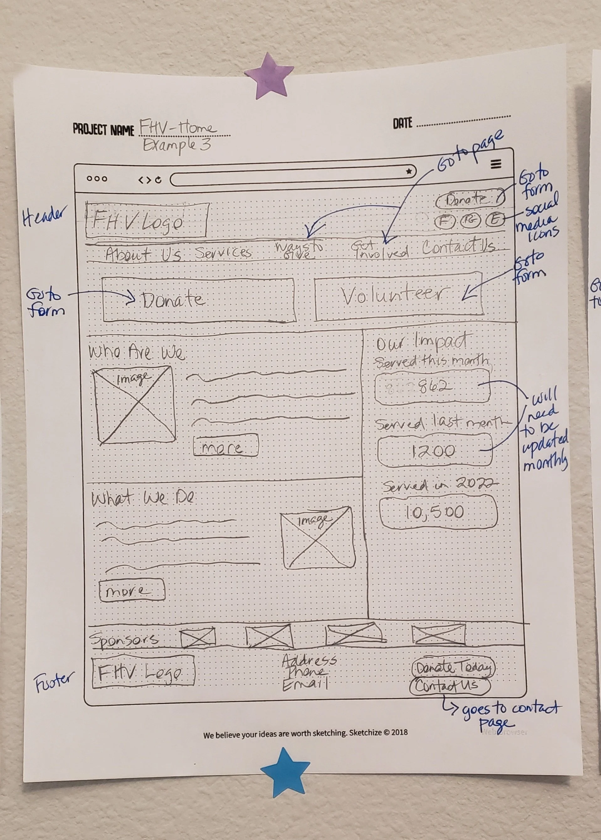
Ideation & Design Process
Our primary focus was centered around three main objectives: facilitating easy online donations, streamlining the online volunteer sign-up process, and delivering comprehensive information about the range of services offered by Feeding Hope Village.
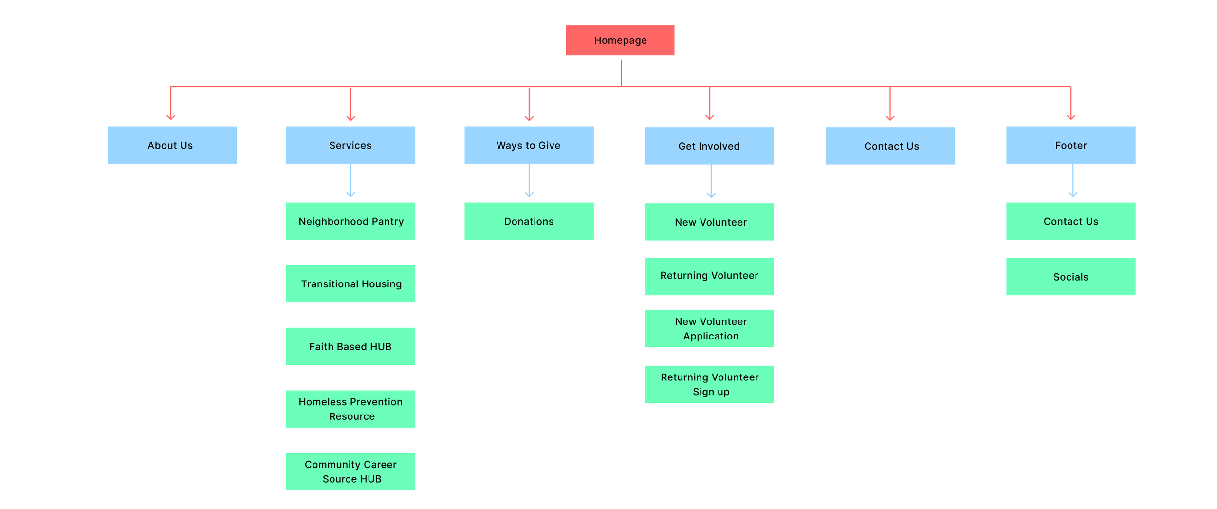
To bring these objectives to life, we embarked on a meticulously planned journey that involved sketching site maps, creating wireframes, developing Figma prototypes, and ultimately implementing these designs into the existing CMS platform. This process allowed us to visualize the site structure, content prioritization, and user flow.


One challenge encountered was the selection of suitable colors and images that adhered to accessibility guidelines without compromising the site's visual appeal. The initial color palette had to be revised multiple times due to accessibility concerns, and some provided images were replaced with high-quality stock photos to enhance the visual impact.
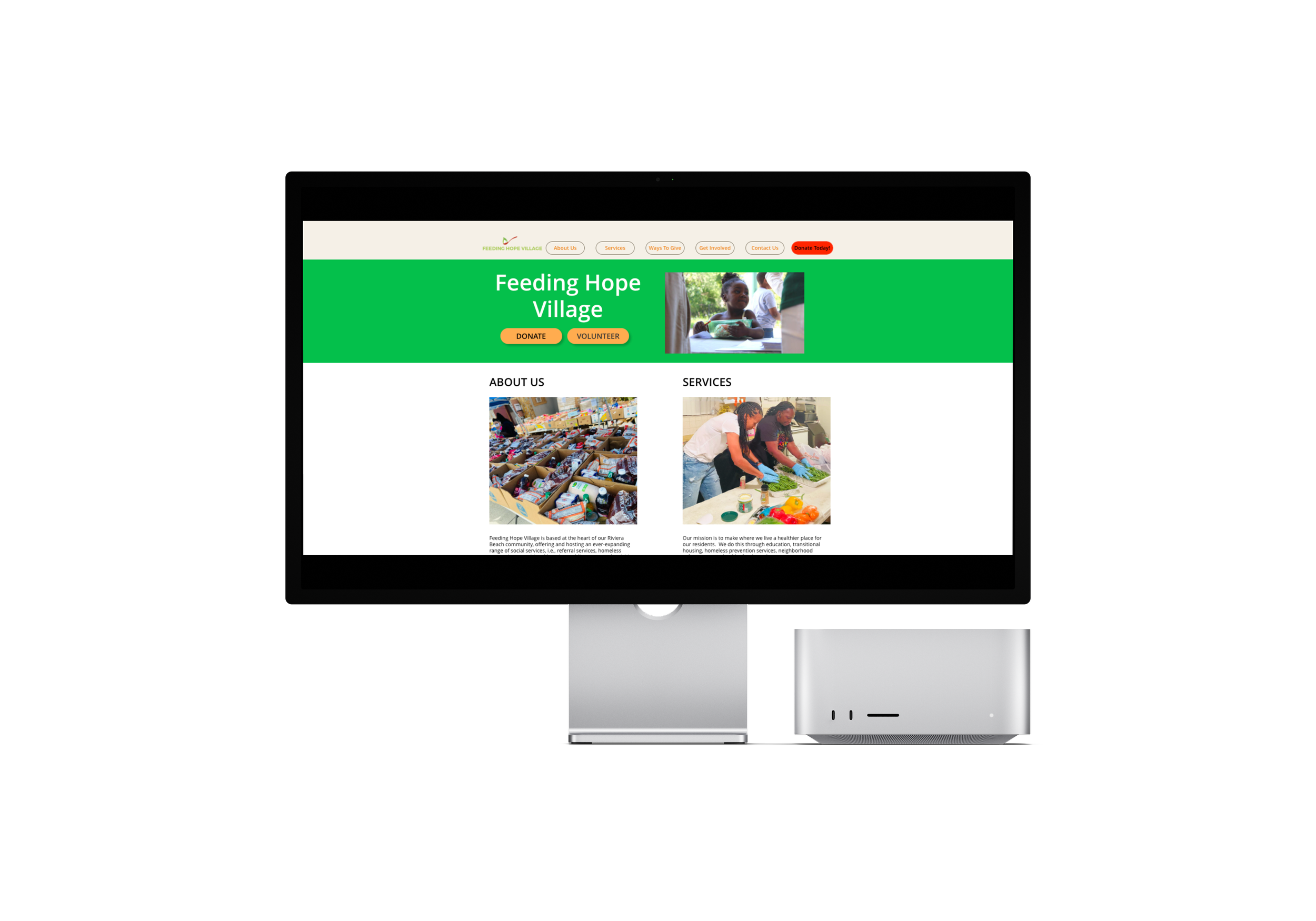
Navigating through the content and design stages, I prioritized featuring images of volunteers actively making an impact. This approach was crucial for embodying Feeding Hope Village's true essence and mission. The hero image, spotlighting a young girl, is a testament to the community children they support. Gratefully, the client provided a rich collection of photos taken over the years, which proved invaluable.
Before initiating the testing phase, I prioritized ensuring the website's mobile responsiveness. Along the way, I encountered challenges with some images getting cropped and text passages extending longer than ideal. After discussing these with the client, we refined and condensed some of the descriptions.

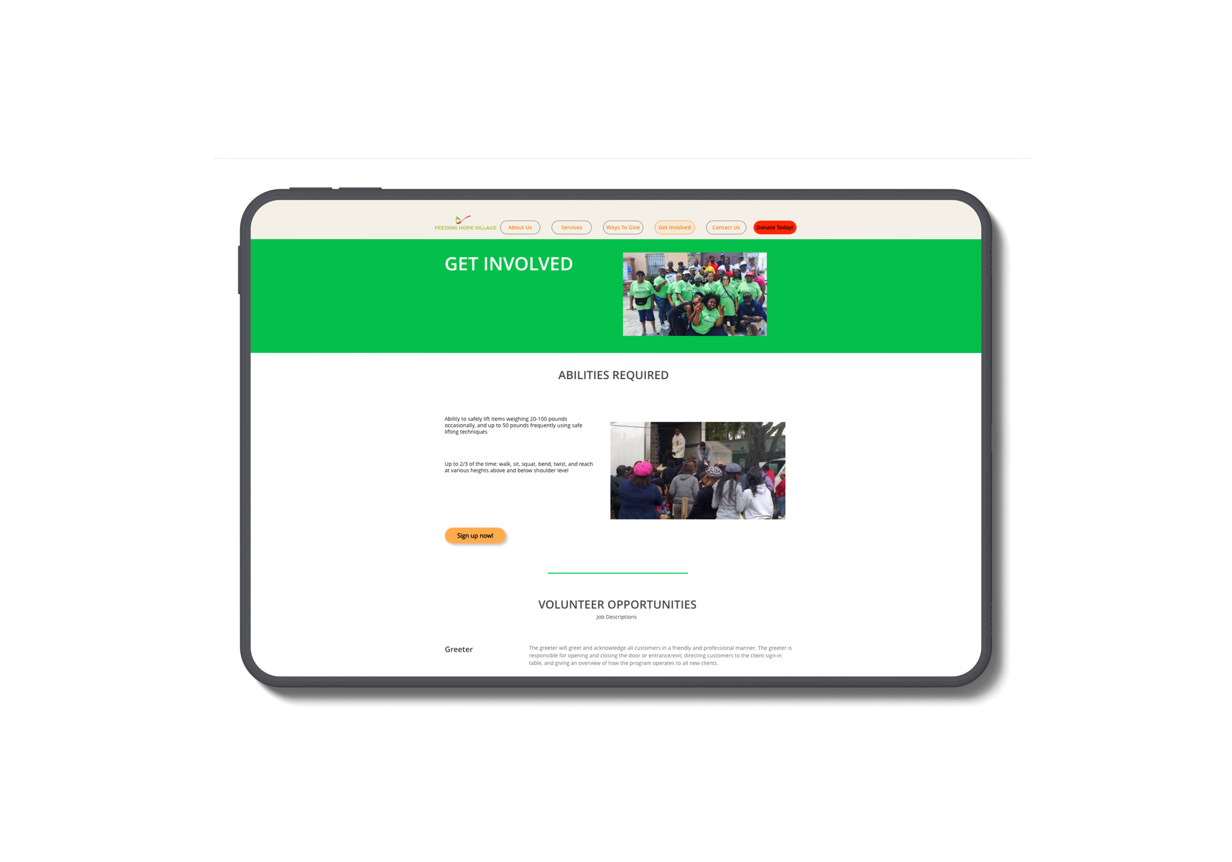
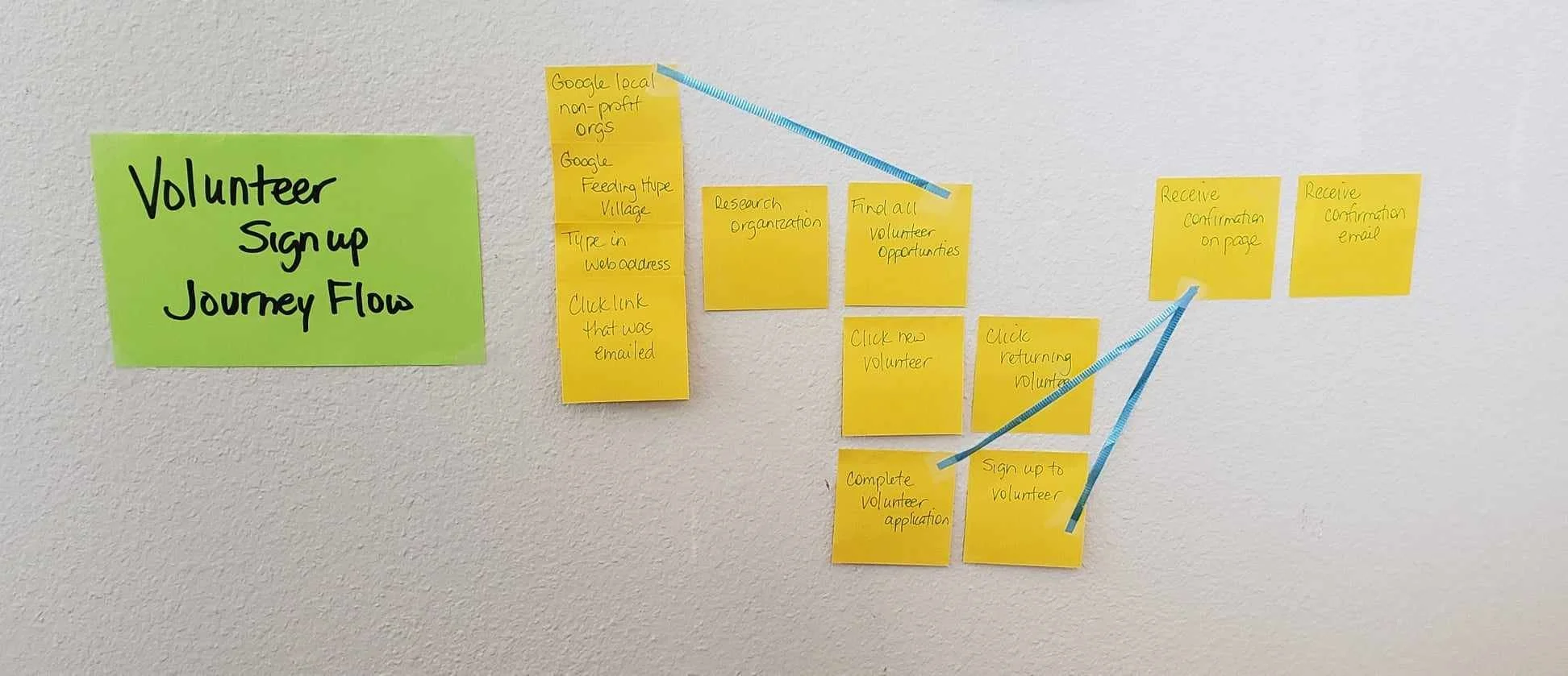
We significantly changed the volunteer page by integrating an online volunteer application process. To make this user-friendly, we worked with the client to simplify the comprehensive three-page-long application into a condensed, concise online version.
The limitations of the CMS platform presented a notable challenge as it restricted the creation of a donation form, necessitating the continued use of a PDF for the volunteer form.
User Testing & Feedback
User feedback and testing played a pivotal role in refining the site. Testers suggested increasing the size of the hero image and using a bolder color scheme to distinguish it from the rest of the page. The inclusion of a statement area was also advised.


Before Testing
After Testing
Two user tests were conducted with a diverse age group. Their insights provided a valuable understanding of user behavior, navigation preferences, and overall site impressions. A few navigational adjustments were made based on their feedback, including repositioning the volunteer and donation buttons.
Final Solution & Results
Incorporating the feedback, we optimized the website by enhancing its visual appeal and improving navigation. Key updates included a striking green banner featuring a compelling image, and clear, accessible donate and volunteer buttons.
The client has expressed immense satisfaction with the final product. The website's improved functionality and appearance have helped Feeding Hope Village attract additional funding and increased visibility in the community.


Conclusion
The redesigned website has fulfilled its objectives of providing an easy-to-navigate platform, where users can access vital information, make donations, and sign up to volunteer. Despite challenges, such as content revisions and CMS limitations, the website now effectively communicates the organization's mission and impact.
The project served as a testament to the power of user-centered design, underscoring the importance of iterative feedback and the willingness to adapt to ensure user satisfaction.